The new way to save and invest
In this 3 week-long project at Changemaker Educations, we worked with Dreams to concept a solution to help educate their users about economics.
Dreams is a savings and investment app with 500.000+ users in the Nordics. They strive towards making saving money easier, more fun, and more achievable.
" How can Dreams include a validated solution for education that increases financial wellbeing in their app? "

First steps
The project began with a presentation by the Head of Insights at Dreams, Kathleen Asjes.
During this presentation, we learned that Dreams aim to spread financial literacy through a more human approach to finances to the people who would rather not care about economics in the first place but feel pressured to do so.
These insights gave our group a feel for the case, who we were working with, and who we were designing for.


Design process
I facilitated our group workshops, and the design sprint we conducted.
During the prototyping phase, I acted as lead designer on the Budget and Home sections of our concept.
Research
We started off by picking the brief apart, writing down all our questions and ideas creating a stepping stone to kickstart work.
By splitting the group into research teams we looked at some of Dreams' main competitors, other solutions we could draw inspiration from, as well as analyzed previously collected data.
During this process, we focused on the overall customer journey, how to best study and teach finance, and Dreams facebook community "Nordic Dreamers".
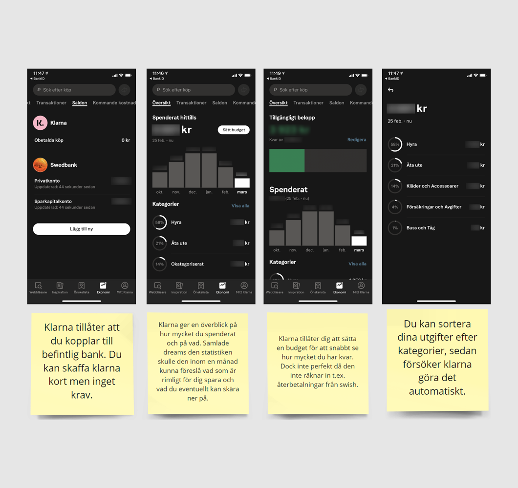
The Klarna app - one of the services I drew inspiration from
Design sprint
We held a design sprint to get as much out of our time as possible. It was here we decided to focus on the core savings loop and how users learn from it.
From these decisions, the team started sketching potential solutions. After a vote, three solutions came out on top, but instead of pitting them against each other in a rumble, we decided that we wanted to try and merge them.
After creating an initial prototype, we tested its usability with 5 people, picking up on all changes we needed to address.

The solution sketch with the most votes
Polish and presentation
During the last week, we polished our Figma prototype, as well as implemented changes based on our test results.
When we were happy with our concept, we switched focus onto preparing our presentation where we were going to unveil our concept and recommendations to Dreams.

Figma - The pages created to make our prototype clickable
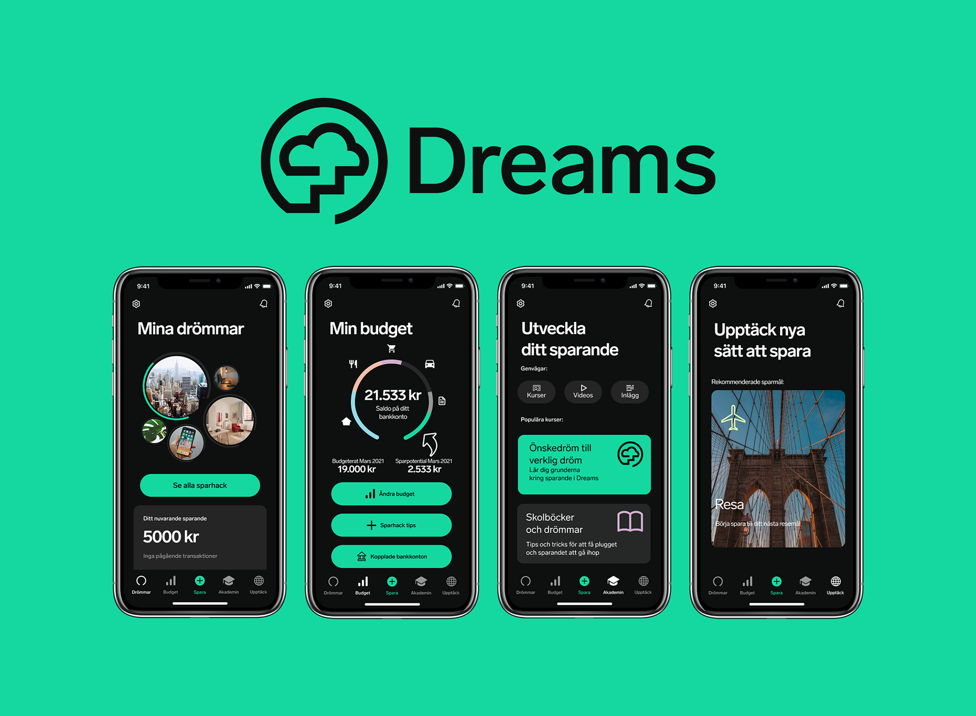
The result
Our primary goal was to answer if it was possible to teach users about economics in a fun non-intrusive way. This is what we came up with.

The Academy section
Dreams had previously delved into teaching with what they called "Dreamsakademin" (Dreams Academy), where users could read long informational texts to later be able to test their knowledge in a test.
The Academy section is our version of this, where we instead treat it in a bite-sized fashion. Users can read a chapter of information or watch it in video form.
Each chapter ends in a multi-choice test, where users are rewarded with a badge upon completion. The system also allows Dreams to reward their users in other means, for example with promotional offers from their partners.
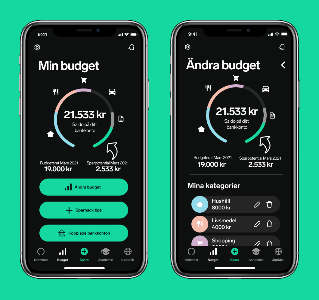
The Budget section
When designing with "learn by doing" in mind, the Budget section was created.
Users can connect their ordinary bank and set up a budget using spending categories to get a clear overview of their economy, and savings potential for the month.
We found this was a critical feature to add since the current offering doesn't take this into account when giving users suggestions.
By analyzing spending behavior, the app can give personal tips and suggestions, with time the app gets to know you better and gets smarter.
Bi-products of design changes
There were lots of features in the current app we liked, but to fit our new features in a logical way, we moved some things around and a few new sections were created.

The Discover section
The Discover section is one of these new sections, here we collected tips and promotional offers from Dreams' partners.
Dreams are also very proud of their community "Nordic Dreamers" on Facebook. So we sought it be appropriate to link to this community, alongside Dreams' other social media presence from within the app.
At one stage in prototyping, we discussed the possibility of moving the community off of Facebook and into the app, but our research showed us the difficulties of moderating a community, this idea was since quickly scrapped.

The new home page of Dreams
Some of the features moved into the Discover section allowed us to visualize a more fun overview of your savings on the home page simply dubbed "Dreams".
Here, your total savings is shown, and your "Dreams" are visualized through bubbles that differ in size depending on the savings target's size. The bubbles are enclosed by a status ring that shows the progress towards your goal.
Final thoughts
Key takeaways
With more time we would have liked to do a second round of usability tests to validate if the changes we had done after the first round was implemented properly.
Personally, I would have also liked to conduct a poll at the beginning of the project to get fresh data from potential users alongside the analysis of Dreams' competitors and previously collected data.
• Getting to follow a brand book was good, and lent more time to focus on UX
• Important to adjust the scope after the time given (quality over quantity)
• Getting to provide insights that would lay the foundation for real changes was a great motivator
Experience our solution
The following prototype was made for educational purposes, pages are in Swedish, and only partially interactable.
March 2021