Clever visitor management
Working with EastCoast Solutions, I focused on implementing the features most requested by the company's users and addressing usability complaints.
EastCoast Solutions is the market leader in visitor management systems in the Nordics, providing solutions that improve workflows for 1000+ receptionists worldwide.
Disclaimer: The below solutions are mostly work-in-progress concepts and only sneak peeks. Some features, and/or designs might not end up in the final products.
" Can we improve usability, accessibility, and recognisability so our services feel more connected? "
Projects
As a UX/UI designer at EastCoast, I lead a broad push to improve the experience for users in several of the company's services.
Gathering customers' thoughts through surveys, interviews, and usability tests I got a good feel for the most requested features, as well as issues with the current offerings that needed to be addressed in the next iteration.
To keep the company's stakeholders in sync, I held several internal ideation workshops allowing all parties to pitch in creating a shared vision for the next generation of the company's business offerings.
Using the Fluent Design System from Microsoft, I could quickly provide a stylish visual theme that provides the user with great feedback on interactions and recognisability across all re-designed services.
Due to an active NDA, the info I can share is limited. Updates to the page will be made continuously as the services are developed and released to the public.
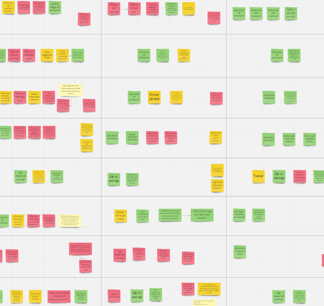
Notes from a series of usability tests
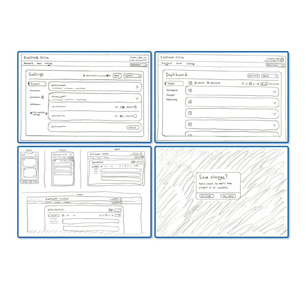
Some early sketches of the new Visit Online
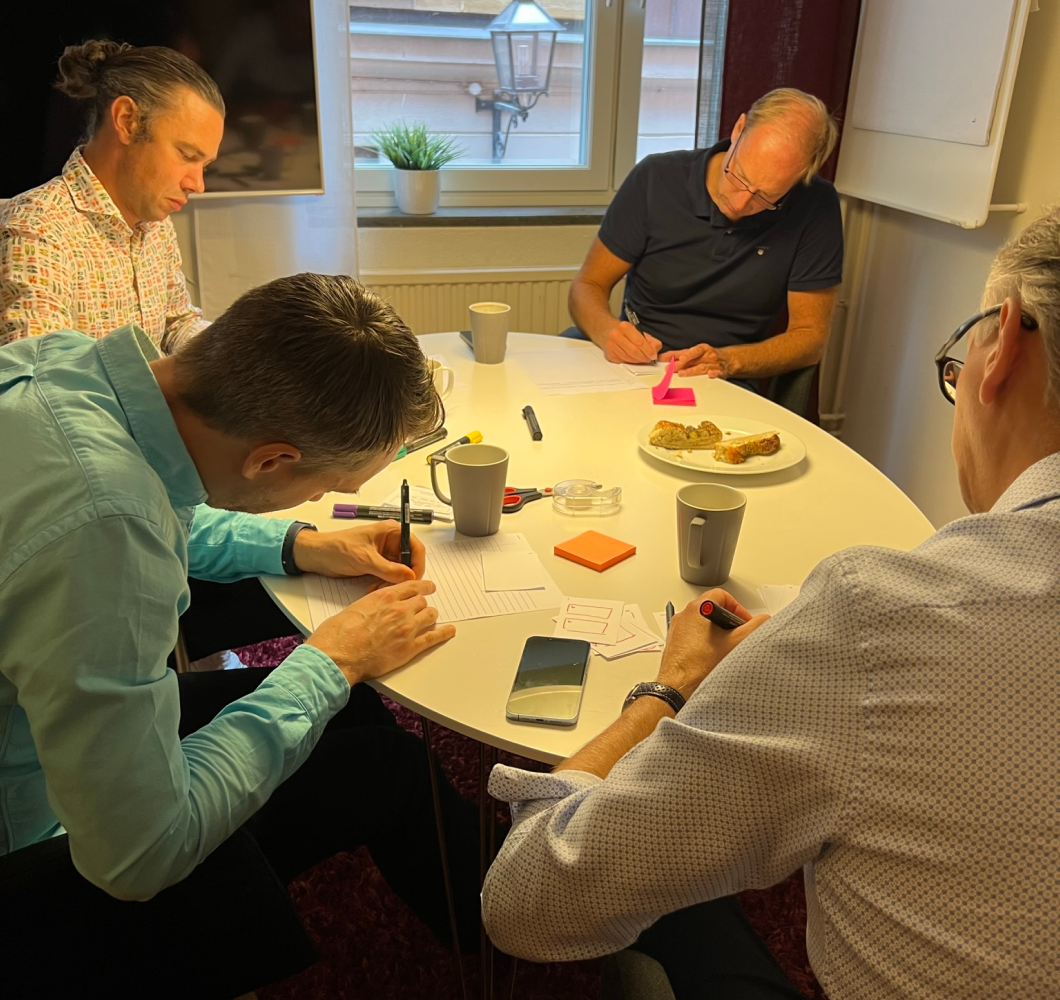
An internal ideation workshop
Visit Online (Web app)
Visit Online is the next generation of EastCoast's staple Visit solution. Previously a locally installed (or "on-prem/premises)" system that provides front desk staff with all they need to administrate their company visitors.
Moving the solution Online in the form of an easy-to-use and responsive web portal allows users to access it easier than ever before - no matter which device they're using.
It also opens the door for better synchronization between EastCoast services, providing users with a more cohesive, and interconnected experience.
Some of the issues brought up by users addressed were...
• Confusing menu structure/hierarchy. Solved e.g. using different designs for main and submenus to provide more straightforward navigation.
• Not easily using the portal on a smaller device. Solved by from the beginning designing the new solution to be responsive.
• Confusing text. Solved by updating and checking translations to reflect better their actual meaning, as well as adding more help texts and guides to more complex administrative actions.
Disclaimer: The above solutions are work-in-progress concepts that might not end up in the final product.
New design (Compilation of themes)
Old version
Escape (iOS/Android app)
Escape, or Express Escape, which is its full name is a cross-platform app for mobile that we hope customers won't have to use besides in drills.
The app is there to help staff in charge of security evacuate (or communicate) with visitors in the case of an emergency. Both versions communicate with Visit to grab the latest list of visitors that can be marked as "in safety".
The new version goes all in on interconnectedness with other EastCoast services, like being able to mark visitors as safe by scanning their visitor's badge and keeping them up to date with SMS notifications sent via the Express Connect service.
Some of the issues brought up by users addressed were...
• Cluttered overview with many visitors. Solved with smarter search and moving "safe" visitors to a second "in safety" list to allow staff to focus on those who still needed to be evacuated.
• No synchronization between app instances. If more than one of the staff was using the app at the same time, their changes did not sync. In the new version, the staff is notified when an evacuation is started by someone else, and lists are synced live.
Disclaimer: The above solutions are work-in-progress concepts that might not end up in the final product.New design
Old version
Check-in (iPad app)
Check-in is an app for Apple iPad that usually sits on the front desk allowing visitors to check themselves in on arrival.
Visitors can check in through a selection of methods picked by the company. A QR code is provided by default in a welcome email if the meeting is pre-scheduled.
New for this version is the option to check in with facial recognition, with technology provided by EastCoast's parent company Precise Biometrics and their YOUNiQ solution. Visitors safely register their faces with Precise through a link in the welcome email.
Visitors can also be checked in manually in the case of an impromptu meeting.
Some of the main changes were...
• Adding support for YOUNiQ. Implementing a second primary option to check in required some changes to the UI to remove the focus from "check-in with QR".
• New flow for manual check-ins that ask questions step-by-step and give a clear overview of how many steps are left.
• Harmonized design for "check-in with QR" and "check-in with face".
Disclaimer: Some of the above solutions are work-in-progress concepts that might not end up in the final product. Others like the new "home screen" and harmonized design for check-ins are live.
New design
Old version
Final thoughts
Key takeaways
Being a part of, and getting to lead a UX push across a broad range of products was (and is) very valuable for one's personal development as a UX designer. Not just needing to keep track of one product, but several, how they communicate and are interconnected was a new and worthy challenge.
Working closely with developers and other stakeholders, validating that solutions are feasible, meeting company expectations, and most importantly addressing users' wants and needs was also something I appreciate having gotten to practice more.
Plenty of the projects just briefly touched upon above are still in development, and I can't wait to see how they come to life and get to share more here.
• Working closely with developers and keeping up solid communication is key.
• While structure that provides greater usability is priority, the "Halo effect" of a visually clean design shouldn't be underestimated.
• Seeing your solutions be developed and come to life is a great motivator for me to keep up creating smart designs.
