The best place to take cooking courses and explore new recipes
In this 5 week-long course at Changemaker Educations, we learned about UI Design principles and applied them in the creation of a tablet and mobile cooking studio site.
Brief & Deliverables
The brief depicted the fictional "Golden Pineapple Cooking Studio" or "GPCS" as I will refer to it for the rest of this case study.
The project's fictional nature gave us almost total freedom in our design choices. Our deliverables included handing in both a tablet and mobile version that needed to be at least partly interactable.
Design process
Follow me and my team on our creative journey making the best culinary website prototype we could in five weeks.
As part of a cross-functional team of 6, I lead the design on the tablet version of the prototype and had a hand in most decisions taken about layout and color choices for both prototypes.
Concept exploration, Low-Fi & Mid-Fi prototypes
Sitemap
We started off by creating a rough sitemap in Miro (whiteboarding software) to figure out how the website's page hierarchy would flow.
We created a sitemap to figure out the sites flow
Low-Fi & Mid-Fi prototypes
With a mobile-first approach in mind, we swarmed, and each member of the group created their vision of how the mobile version could look in a Low-Fi version.
The team's ideas were then combined into one joint Mid-Fi prototype.
Our early prototypes
UI Design principal exercises, and research
UI Design
During the second week, we were provided with a set of exercises that varied in nature but had one common goal - to get us an understanding of what they are and why they're important to keep in mind when designing.
A mood board created from our research into: Simplicity
Research
Our team tackled these exercises by researching an abundance of web solutions (not just in the culinary space but also other non-related apps and products we use day to day).
This proved to be really useful for our design thinking and we ended up with a lot of ideas of do's and dont's by pointing out out the good, the bad, and the ugly in the offerings we researched.
A screenshot of our testing area for typefaces, colors and logotypes in Figma
Building the High-Fi prototypes
During the third week, we started work on the High-Fi prototype. Having tried out the mobile version in Low and Mid-Fi versions and found the overall flows to work we shifted focus to the tablet version.
As we progressed on the tablet version, a part of the group split off to work on the mobile prototype.
Typefaces, Colors, and Logotypes
We chose Quicksand and Poppins (Two popular Google typefaces) for their great readability and playful looks.
Quicksand was used for all headings in our prototype, and Poppins was used for body text.
Inspired by the drink "Mexican sunset" we picked out different shades of orange that we felt matched the Golden Pineapple brand perfectly with a golden-ish sunset look. It also gave our prototype a fresh feel, which we wanted our culinary side to have.
We created a simple logotype to complete our brand profile.
The final prototypes
With all the choices we made described in the phases above, we iterated on the looks and functionality of both versions for the rest of the course. Below you can experience what we came up with.
Tablet version
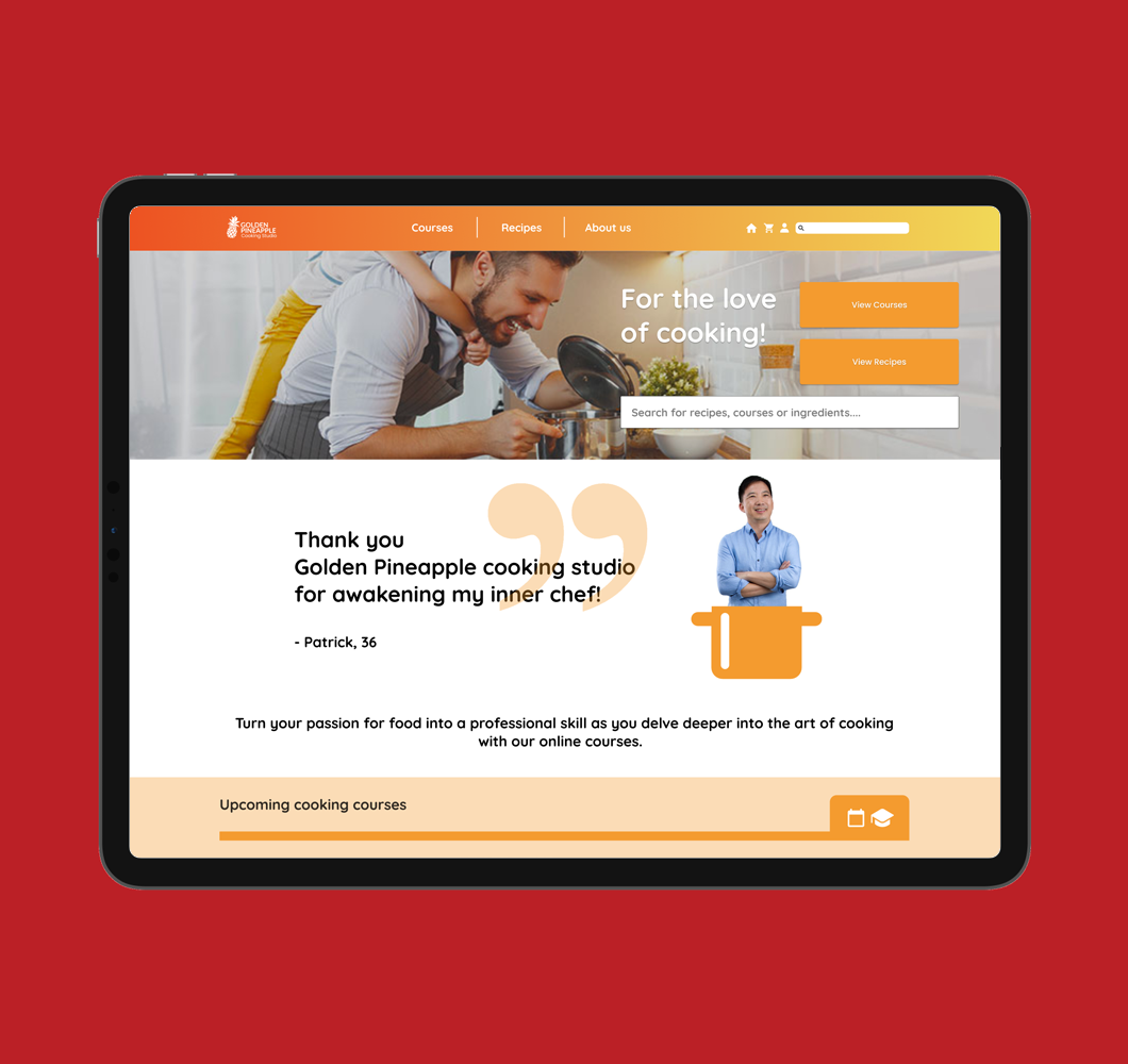
Landing page (Tablet)
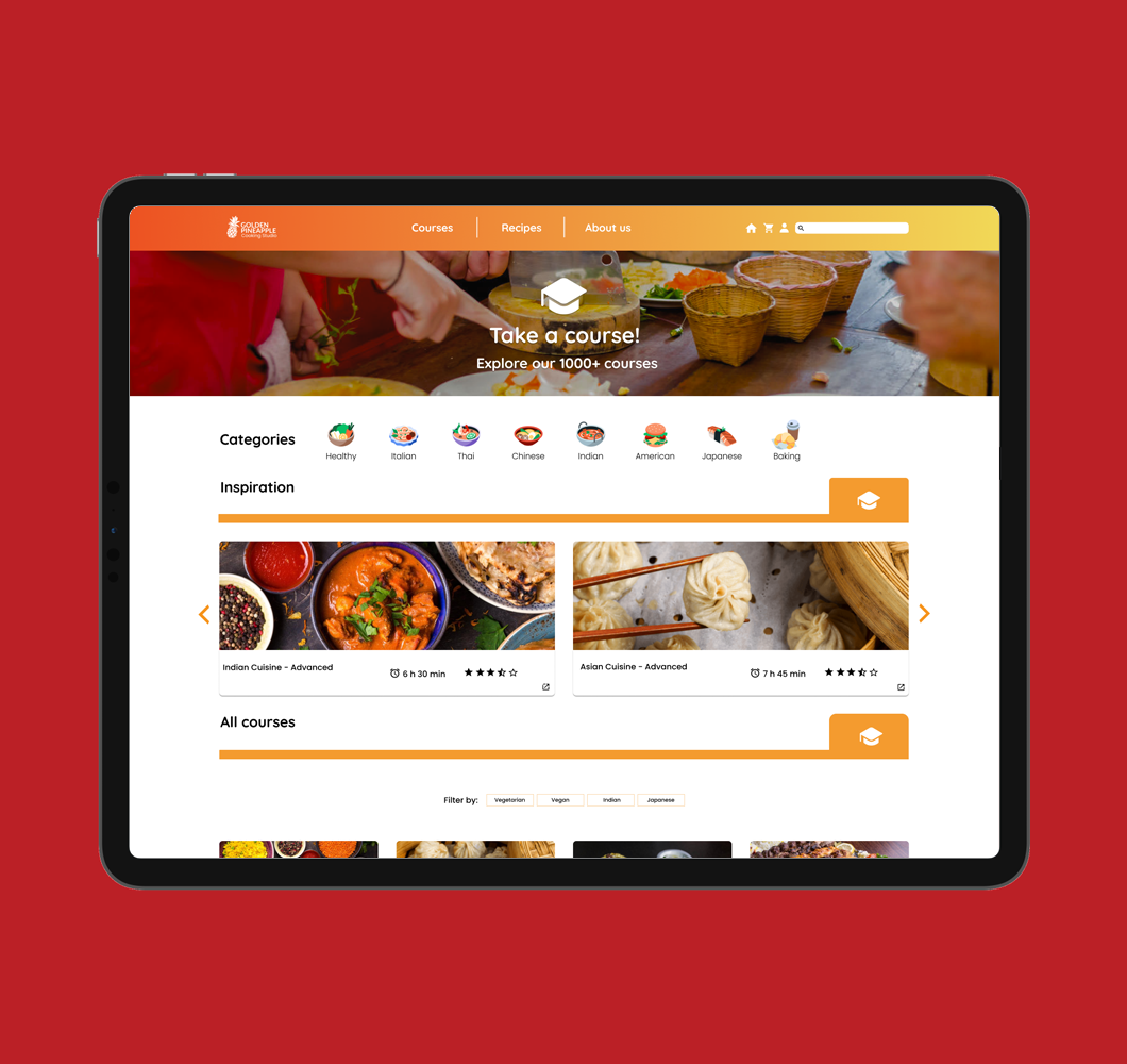
Courses page (Tablet)
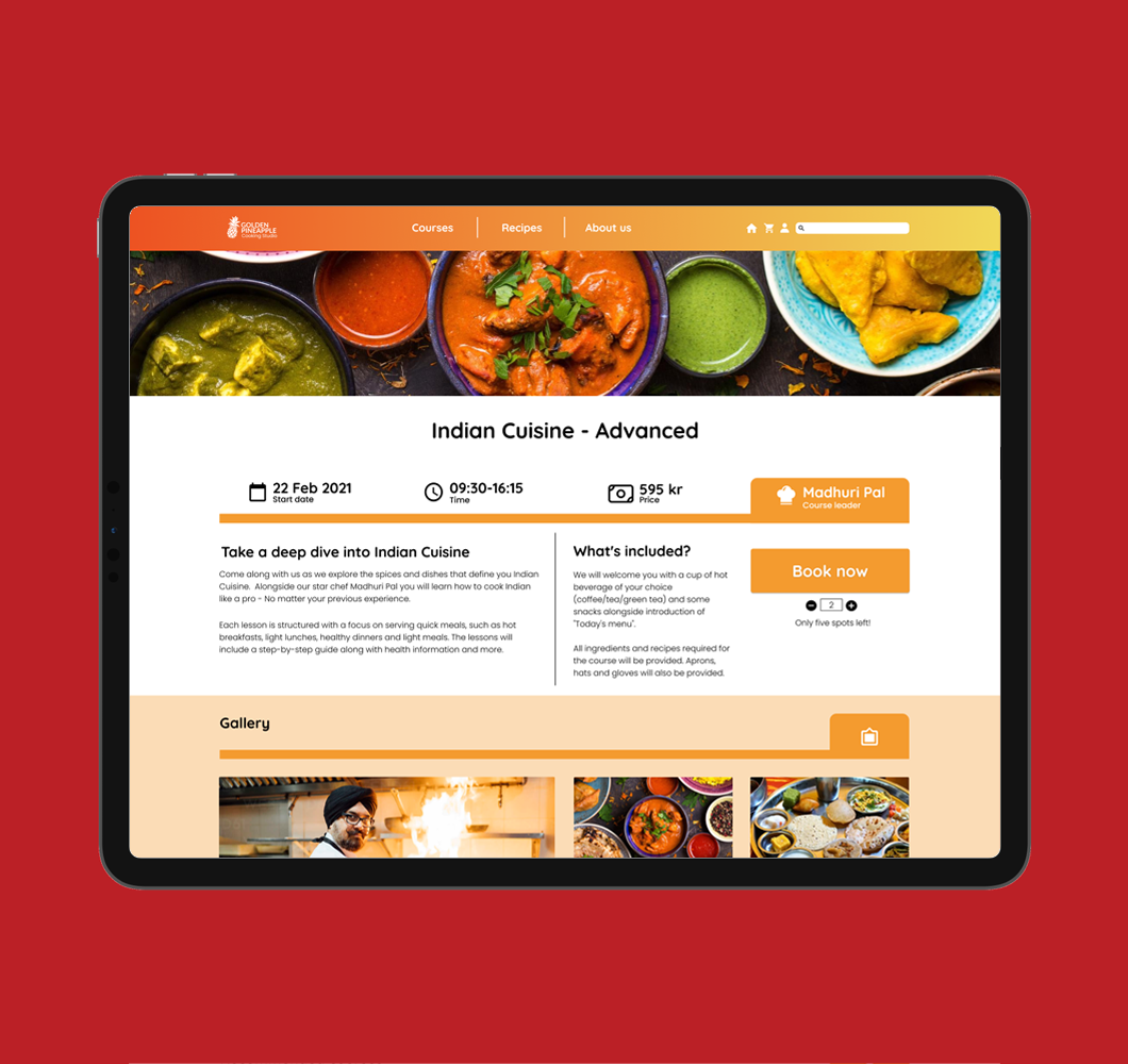
Example course (Tablet)
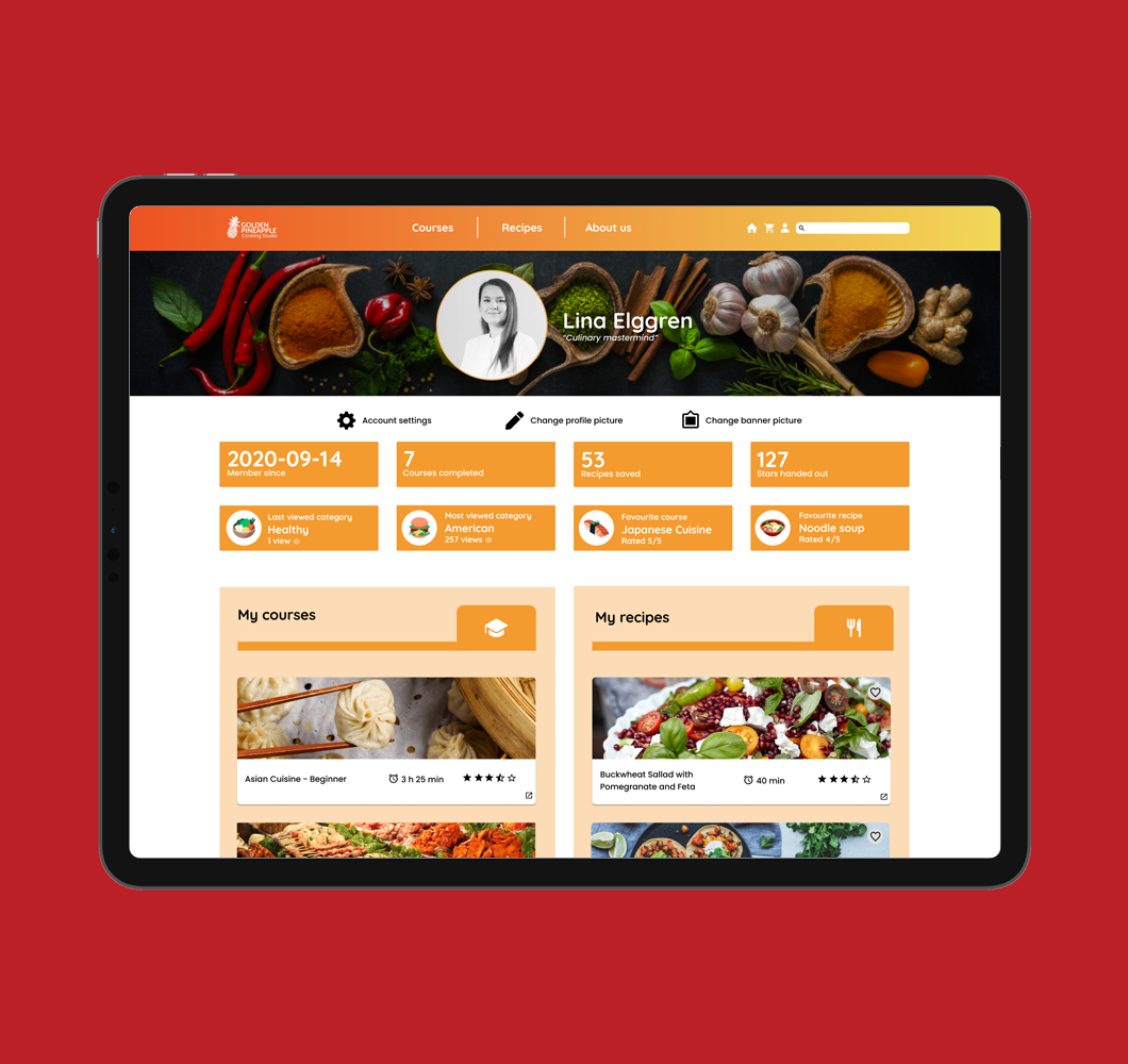
Profile page (Tablet)
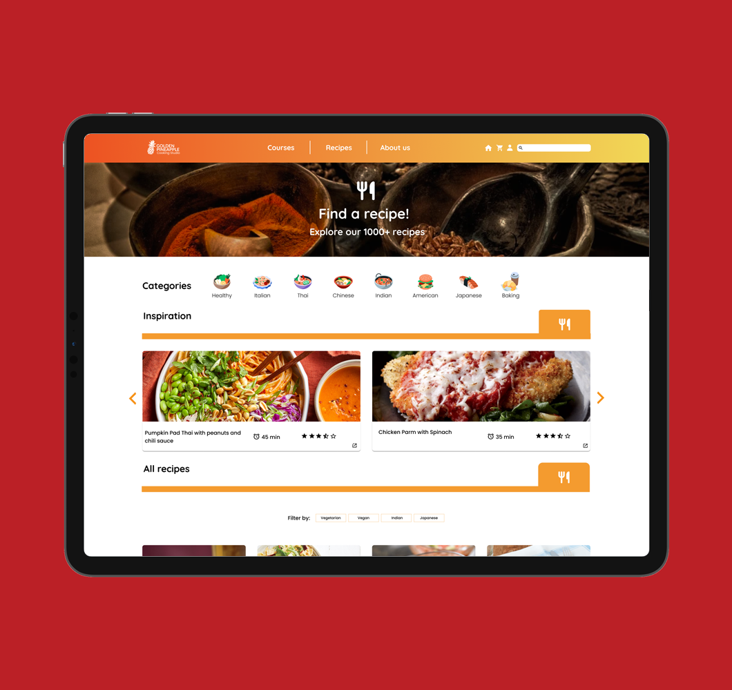
Recipes page (Tablet)
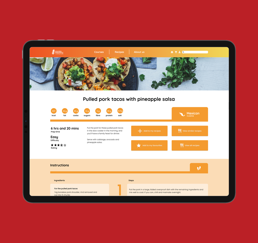
Example recipe (Tablet)
Experience the tablet version
The following prototype was made for educational purposes, pages are in english, and only partially interactable.
Mobile version
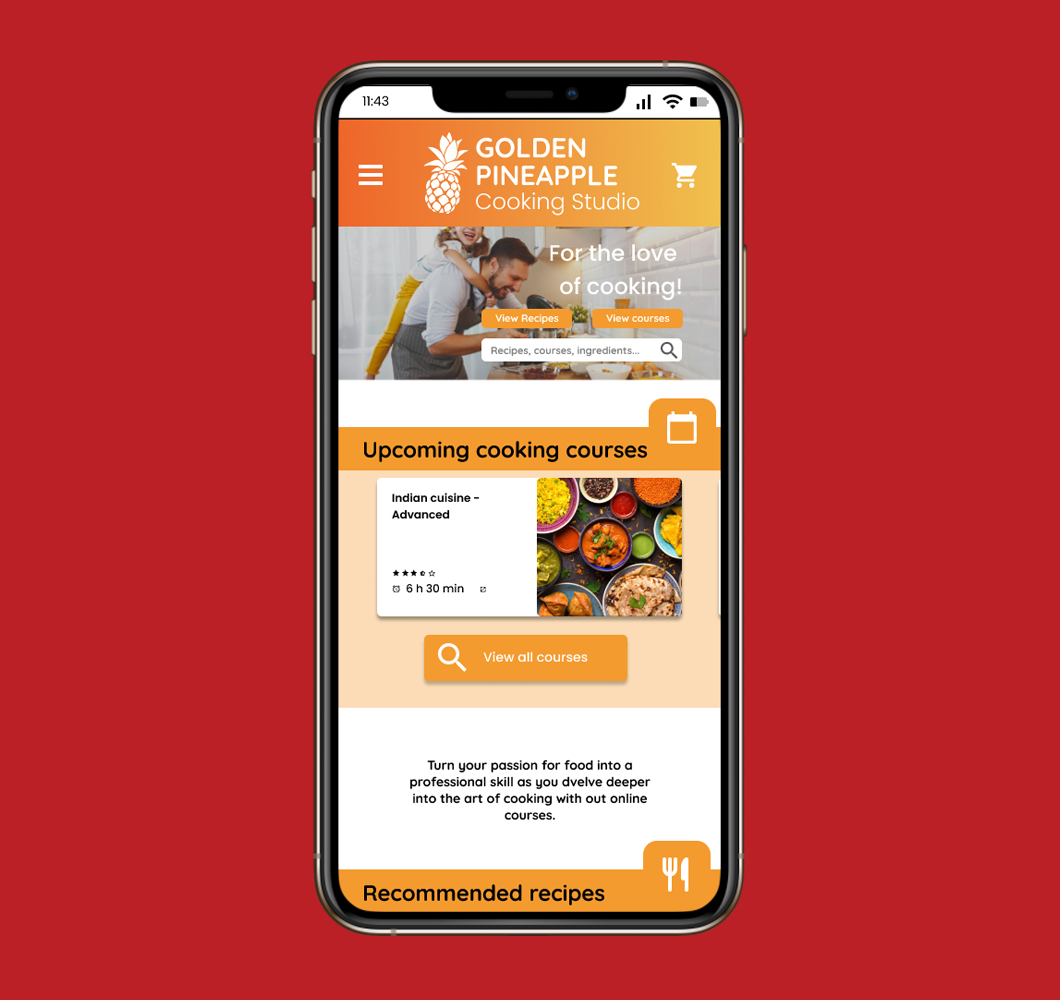
Landing page (Mobile)
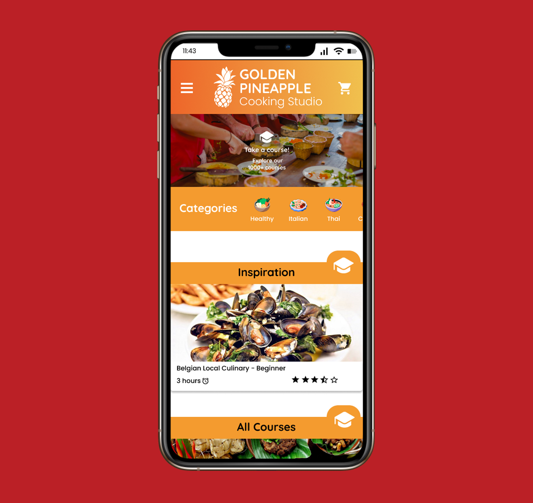
Courses page (Mobile)
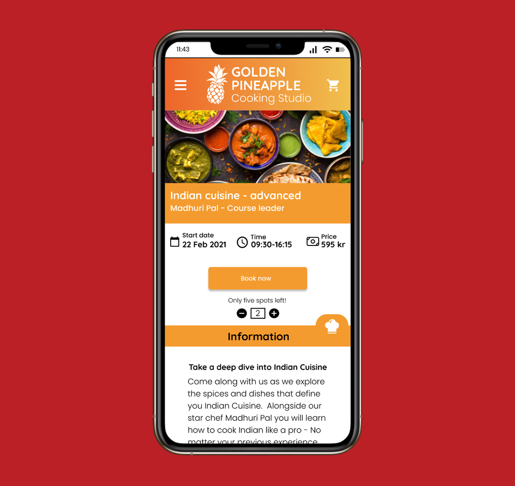
Example course (Mobile)
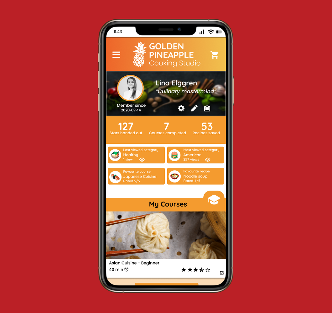
Profile page (Mobile)
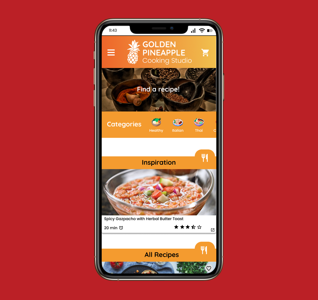
Recipes page (Mobile)
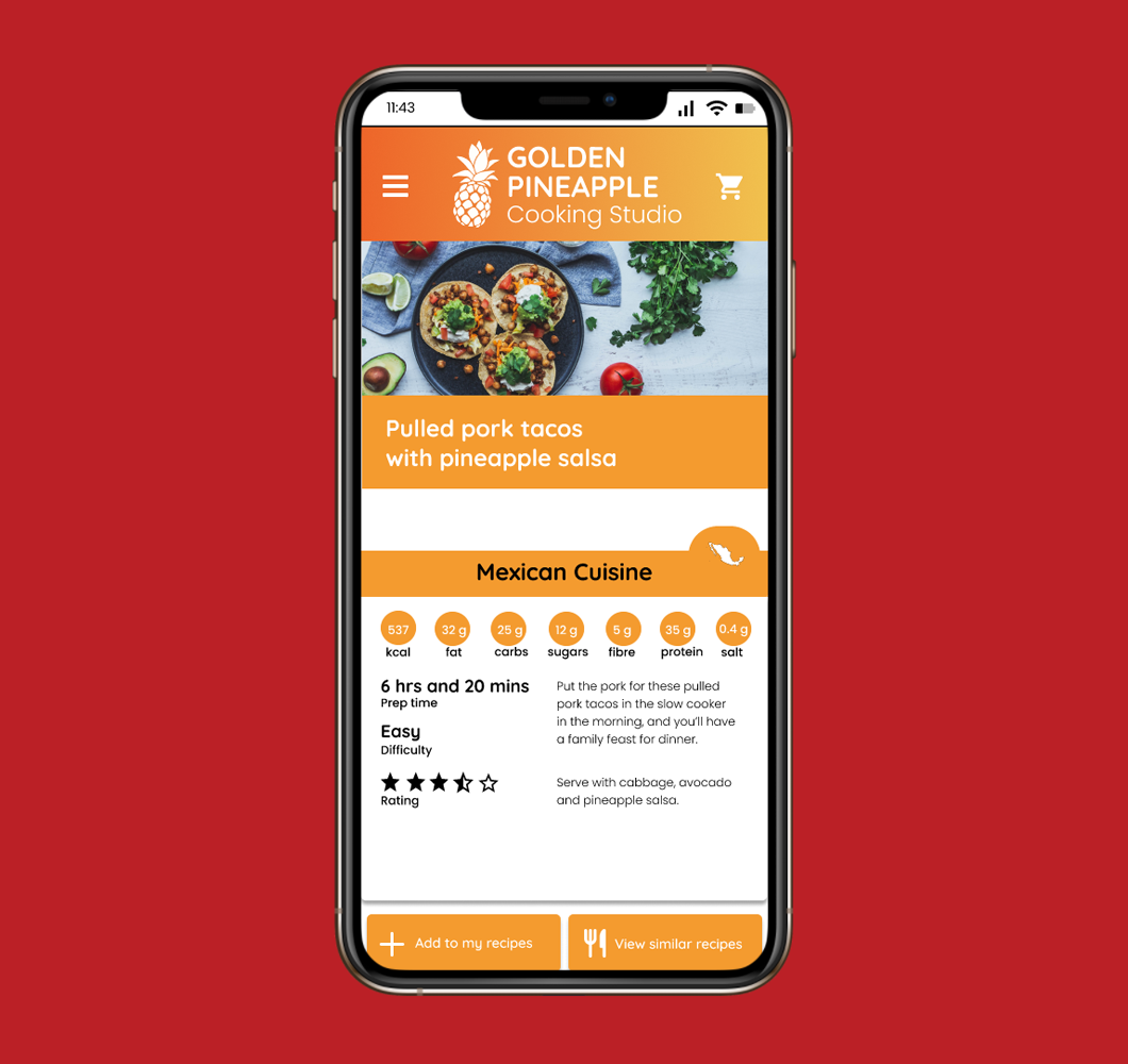
Example recipe (Mobile)
Experience the mobile version
The following prototype was made for educational purposes, pages are in english, and only partially interactable.
Final thoughts
Key takeaways
I'm very happy with the outcome, but in hindsight, I wish we would have conducted usability tests to actually test our designs (We first studied user testing after the prototyping course and were unfortunately not able to test this concept in it).
I feel we would have gotten valuable insights from testing it, letting us iterate on the designs based on more than our own assumptions and ideas.
I would also like to have been involved in the development of the mobile version, getting to optimize for smaller screen sizes.
• Creating a brand new identity was freeing, but also time-consuming
• Having UI design principles fresh in mind was valuable
• This project really revamped my Figma knowledge, having me actually start using it properly instead of treating it as Photoshop with interaction
February 2021
